From Issue Seven of Gear Patrol Magazine.
Many aspects of watch design are fascinating to analyze, and a true connoisseur can wax poetic about them all. Watchmakers, especially, will scrutinize every possible detail, but far too often, they fall short when it comes to one in particular: dial font.
Be it a generic typeface, one that doesn’t properly fill out dial space or simply a font that feels misplaced, there are a great many missteps that can kill an otherwise beautiful design. There are a few manufacturers, however, that know how important it is to develop a typeface that does a watch justice — here are three doing just that.
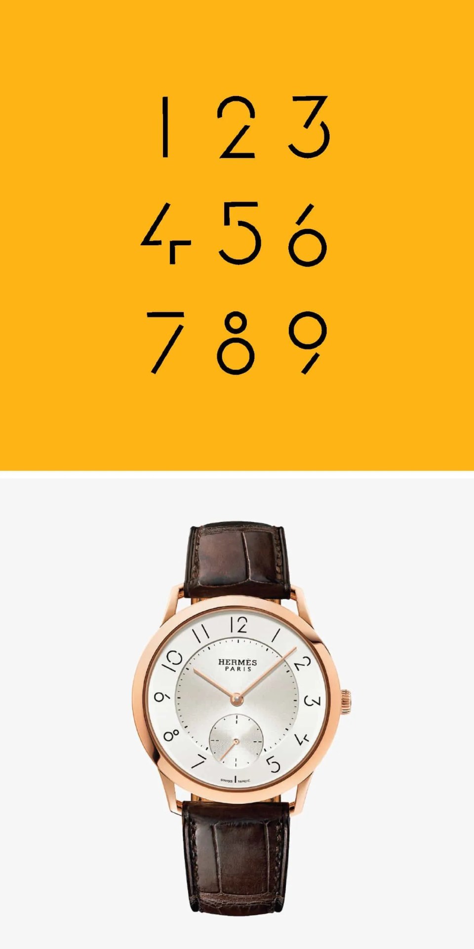
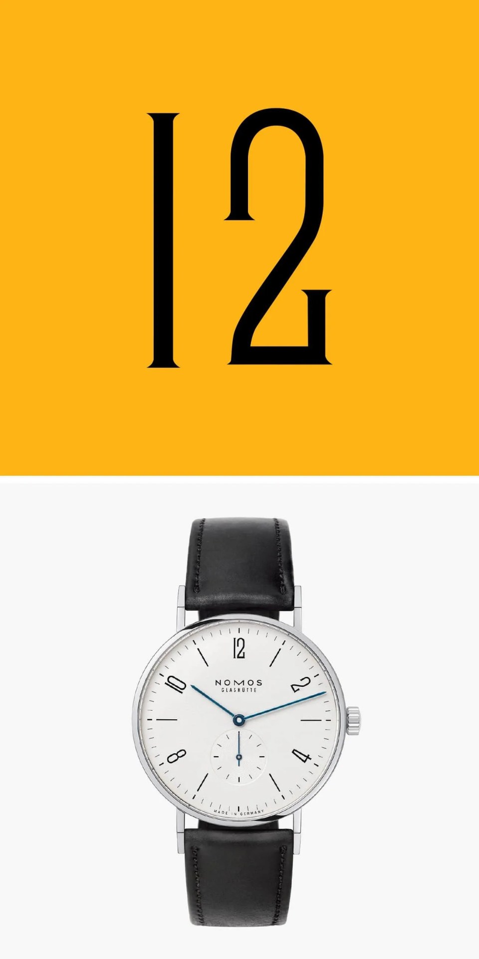
A few years ago, Hermès approached the French graphic designer Philippe Apeloig to create an all-new typeface for its upcoming Slim d’Hermès. The French fashion house, in the midst of adding more in-house movements to its collection, only stipulated that the font do justice to the light, sharp architecture of the minimalist timepiece. Apeloig — whose work with typography was well-known in France — delivered one of the most distinct typefaces the watch industry has ever seen.
“The challenge was to make the watch light visually speaking, pure and perfectly in harmony with a sense of minimalism,” Apeloig says with the kind of poeticism you’d expect from a Parisian designer. “Sobriety and minimalism were the qualities I was reaching for, so I built in constraints, limiting the number of shapes — circles, triangles, curves, dashes — that I could use to create the numbers.”
The typeface on the Slim d’Hermès is sleek and minimalist, but its most striking aspect is the presence of several “imperfections,” as Apeloig calls them, that bisect each character and were vital in helping Apeloig achieve his vision of visual lightness and balance. “They reduce each number to its elemental parts… when the numbers were assembled in a grid, a rhythm arose between the blackness of the line and the whiteness of the voids,” he says.