
22 photos
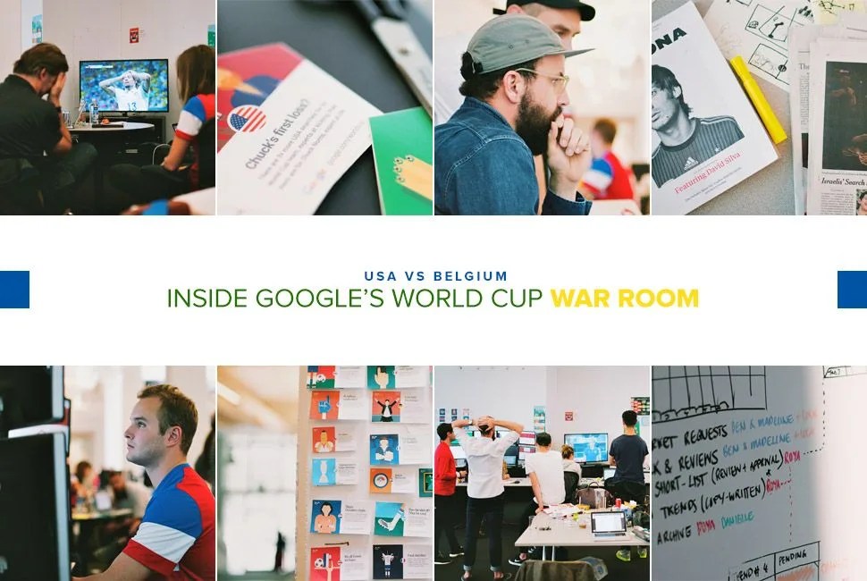


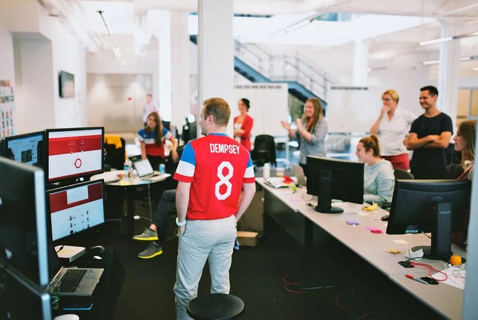
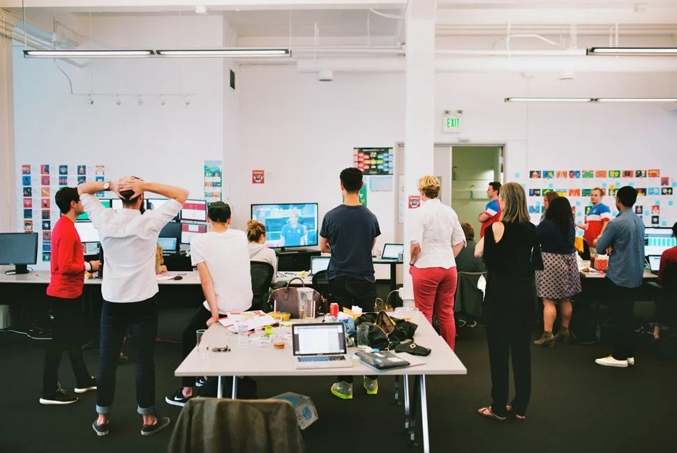
If the World Cup isn’t about triumph or tragedy as eleven countrymen fight for national pride with illustrious skill, then dammit, it’s about data. And where there is data, there is Google. Every match a team of analysts, writers, and artists are standing by holding their finger to the social pulse of the world, and when something big happens, Google’s World Cup War Room responds.
MORE SPORTS AND TECH: Primer: How to Watch the World Cup | The Tech that Changed the 2014 Olympics | Glass Dismissed: Ground Rules for Your First Foray with Google Glass
The War Room sits on a tranquil circle in the shadow of the San Francisco’s Giants AT&T Park. Outside, I watch techies with lattes mill about in a small park, but it’s not long before my attention is drawn back inside, where the Google Trends team’s broadband is set directly on Brazil. Google is poised for a coverage attack on the World Cup, with their daily Doodles, the search result One Box (integrated with ESPN), and Street View team’s coverage of Brazil’s painted streets and stadiums. And then they have data.
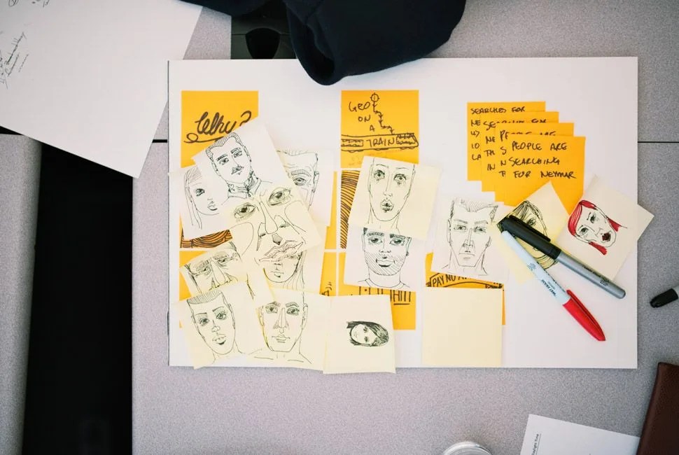
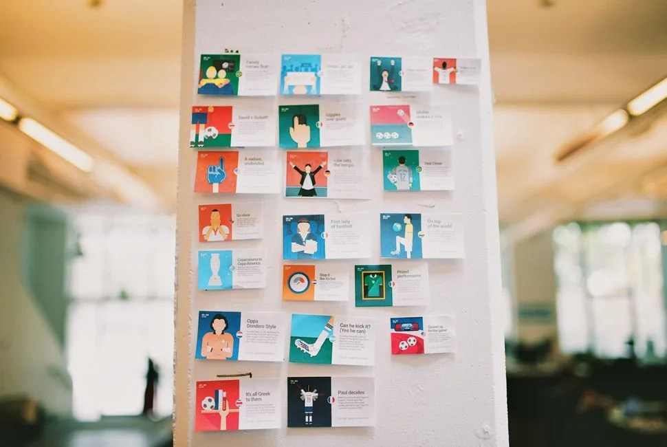
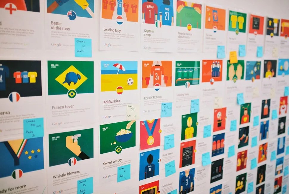
As part of the Google Trends movement, Google’s amalgamating info from 1.5+ billion searches about the Cup and putting it into visually cathartic displays. Every match has a trend page, and each match sees at least one cartoon (the team calls the illustrations, straightforwardly, “Trends”). Some Trends are profound (“Even with the NBA Finals still in progress, USA searches are 10x higher for the World Cup”); some are trivial (“There are 3x more USA searches for its World Cup team, experts at kicking, than there are for Chuck Norris, expert at life”). Regardless of its implication, each trend is like a bite-sized bar fact, something that you wouldn’t have known otherwise. Google making you clever.
As part of the Google Trends movement, Google’s amalgamating info from 1.5+ billion searches about the Cup and putting it into visually cathartic displays.
The Google Trends team — when there’s not a World Cup at stake — takes search interests and puts them into mildly evocative charts (like plotting the timeline of when searches for the “Syrian Civil War” trumped searches for the “Syrian revolution”). They look for symmetry between facts. They look for spikes in interest and the world events that caused them. They look for the incredible and the data that supports it. Like Ángel di María and his divine goal.