The Most Iconic Craft Beer Labels, and Their Stories

Who designs your favorite craft beer labels and cans? What inspires them, and how do they translate great beer into expressive, convincing art?

BEER-Labels-Gear-Patrol-LEAD-1600- Illustration By Henry Phillips

Behind the frosted glass at your local bottle store stands an unorthodox display of modern art. You’ve slugged back its muse for years, popped its logoed caps to get at what’s considered the star of the show: the beer inside. But chances are you’ve never turned your passion to the vast exhibition standing in neat, chilled rows — the labels and designs on the cans and bottles themselves.

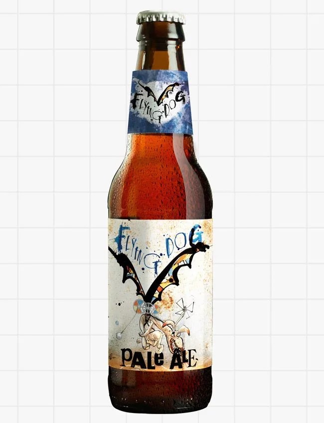
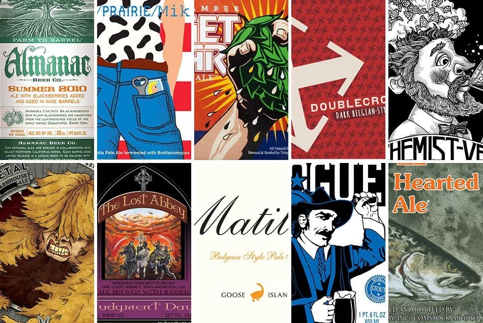
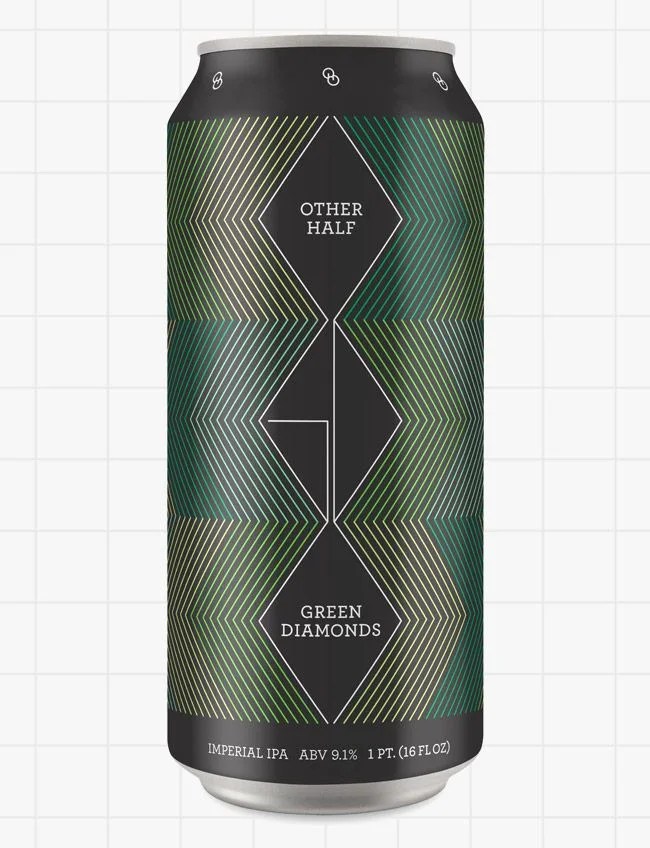
At their worst, craft beer labels can be confusing and thoughtlessly attention-grabbing, colorful collages splayed onto a bottle with amateur skill. But at their best, they’re thoughtful and thought-provoking, catchy and beautiful — eloquent and imaginative translations of the complex liquids inside the can or bottle. And as craft beer becomes more paradigm than upstart, beer labeling and design has morphed into one of the main sources of and venues for its inspiration and creativity.

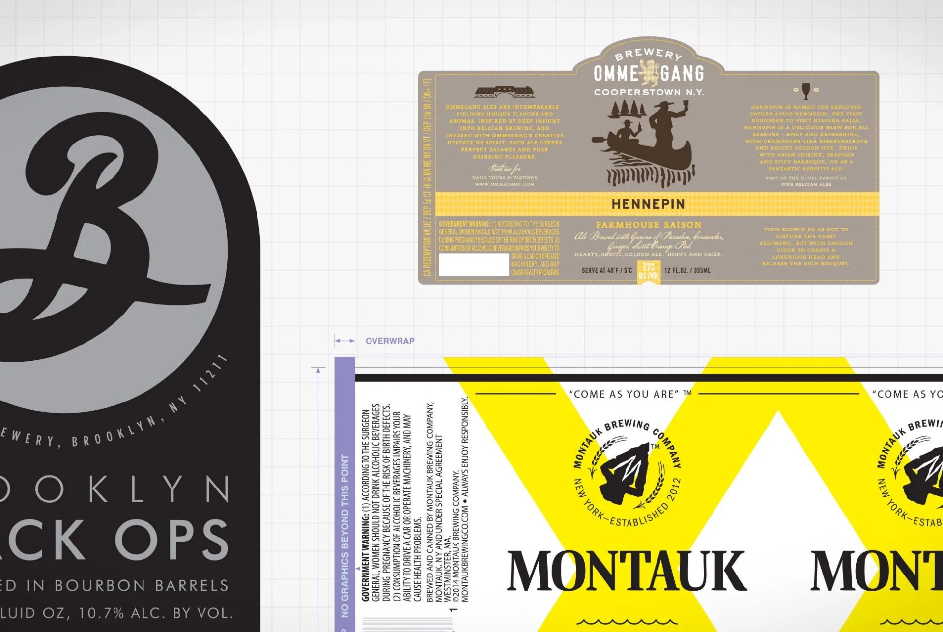
Just like the craft beer business, labeling art and design have experienced massive changes in the past several years. “Everybody is trying so many things to differentiate themselves”, said Larry Bennett, who’s been Creative Services Directer at Ommegang Brewery in Cooperstown, New York for over 10 years. The increased competition within the craft beer market — there are now nearly 3,000 craft breweries in the US, with more than $14.3 billion up for grabs — has inspired brewers and marketers to put more thought (and money) into the look and feel of their beers’ packaging, rather than just the beer itself.
yeah
“These beers tend to have a fairly good margin to them… The cost of packaging is, well, not even remotely close to being ignored”, Bennet said. “It is a sort of a given for these beers: you have to spend some time, money, and effort on the packaging.”

With this design boom comes a desire to look behind the curtain at the people involved: creators, artists, designers and brewers. When The New York Times asked Milton Glaser, a design legend and the man behind the iconic Brooklyn Brewery identity, to critique a set of prominent labels, his review went viral.

In that story, Glaser explained that his theory of design was “the creation of affection” — though “affection” was not a good term for his feelings toward some of the other labels. Drinkers also have strong opinions on the matter. Empty, one man’s trash can be another man’s treasure, washed out and stored on the mantle with pride. (Two close friends, both beer aficionados, unleash their inner litigators when the topic of Maine Beer Company‘s austere labels come up.) That’s another wonderful part of craft beer design and artistry: its divisiveness is only heightened by its subjectivity. This makes a good label the perfect pairing for a good beer, more than any burger or porch rocker, because craft beer is about social enjoyment, good company and good conversation.

At their best, craft beer labels are thoughtful and thought-provoking, catchy and beautiful — eloquent and imaginative translations of the complex liquids inside the can or bottle.

In fact, design has more effect on the end product than most drinkers realize; more and more, the design side of craft beer is influencing brewers and breweries, leading the beer’s style and intent at an early stage rather than the other way around. And canvass your friends: how much do their favorite beers correspond to their favorite labelling? (Answer: a lot.)

Though it runs parallel to the craft beer world, suckling its lifeblood and meaning from the water, malts, hops and yeast, the design behind beer is significantly less understood. It’s been less scrutinized too, and less enjoyed, than the liquid it represents and attempts to translate. Few questions are asked or pondered as to its significance for beer, or what it takes to produce the art and design for entire lines of suds, or even who’s doing it.

To answer these questions, we went straight to the source: the experts and the professionals, the designers, artists, brewers, marketers and people who do it all for some of the most creative and successful craft beers in America. Their insight offers a view that’s beautiful, convivial, intentional and contradictory. It’s the perfect case study in a blossoming art form.

The Experts

expert-panel-beer-label-design-gear-patrol-FINAL

The Questions

How did you get into beer design?

MILTON GLASER, Designer, Brooklyn Brewery: One of the great mysteries and a secret to much good work that is done is the affinity that a client has with a designer. If it’s not there, something is really missing and doesn’t materialize the right way. All the jobs I’ve ever done in my life that are meaningful to me are for people that I like. I like Steve [Hindy], although he was very guarded in trying to find out exactly what was going to happen, but he literally came after a cold call and came to see me.

It was an interesting idea of a brewery in Brooklyn, and I was interested in Steve, who was an ex-journalist that didn’t seem suited to go into the beer business… What I offered him was, I said I’ll take some of the equity in exchange for the job, and we arranged an equity share and a significantly lower rate of the fees normally associated with this kind of project, and I just went to work.

About our Expert: Milton Glaser Design | Brooklyn Brewery

BRIAN STRUMKE, Founder and Brewer, Stillwater Artisanal Ales: When I got into this, it was more of an artistic endeavor. It was a creative avenue for me… I wanted people to look a little further into the liquid. So I gave them something further to look into.

About our Expert: Stillwater Artisanal Ales

Flying-Dog-Offset-Gear-Patrol-
“Ralph just does whatever the fuck he wants. And we love him for that.” – Erin Weston

JOE MARIANEK, Designer, Other Half Brewing: Design came first for me. I grew up in Columbus, Ohio, about a mile from an Anheuser-Busch factory where, on days when the wind was blowing west, the air smelled like either rotten corn or cat urine depending on your sense of smell. So naturally, I was never very interested in beer at a young age. However, my appreciation for beer packaging design was seeded by an uncle in Milwaukee who has a collection of hundreds of quirky and beautiful cans from small and now-defunct breweries from across the Midwest. And coincidentally, while I was studying graphic design at the Rhode Island School of Design, my first professional internship in NYC involved assisting on beer labels with the design legend Milton Glaser. Glaser created the identity and packaging for Brooklyn Brewery, which is often credited with bringing the independent/craft brewery scene back to New York City. And, I was compensated with free beer and posters, which was actually very appreciated.

About our Expert: Joe Marianek, Small Stuff Design | Other Half Brewing

STEVEN SPEEG, Co-Author, Cool Beer Labels: I started homebrewing years ago. So I have been making my own beer, and I am also a graphic designer. So I create my own labels when I do my homebrew, and that’s kind of what led me into the craft beer industry — some of the cool beer labels that were coming out on some of the newer beers. Years ago when craft beer was kind of in its infancy, I would go to the store and pick up something, and instead of grabbing my usual, something else would catch my eyes — some new company. I was like, “Oh, this is kind of cool. Let me check it out.”

About our Expert: Cool Beer Labels

SAM CALAGIONE, Founder and President, Dogfish Head: I guess design interest came before beer. I took a lot of art and creative writing classes in high school and college. Then I got in to punk rock and artists like Raymond Pettibon who did a lot of Black Flag albums, and Warhol for the Velvet Underground … then I started writing the Dogfish business plan and moonlighting at an ad agency two years out of college. That’s when I designed the Dogfish logo — soon after I found a 19th century rubber stamp set and cut and pasted and scanned the letters into our unique “doggie” font.

About our Expert: Sam Calagione | Dogfish Head

How did you come up with a design and identity for your beer?

brooklyn-brewery-logo-gear-patrol

MILTON GLASER, Brooklyn Brewery: One of the things I liked about traditional labeling largely of Bavarian beers was their complexity and their grace of execution and their departure from the current vernacular that’s used by the big companies, which is sort of modern-looking and simple minded in most cases. I wanted to do something that had the sense of craft — that was well made, had tradition, and yet, with a kind of sense of contemporary labeling that looked slightly out of place in the market surrounding by the other beers. And so the color and the use of gold and the identity of that sort of B out of foam all came together to produce something that was a little idiosyncratic, but also in connection with a longer tradition.

It’s very suggestive. It’s almost as if you’re drawing the object rather than a piece of type. It’s a tempest of swirl in a way that foam swirls around the top of the glass.

I always have this one quote which is, “The mind is a very poor instrument at examination of the self.” What I do is I just do it. I mean, the back of my head is much smarter than the front of my head. I mean, what I achieve intuitively is what I hope represents the best. But the way you start is with what you know — which in this [case] is a reference to Germany. You give yourself all the type of logical guidelines, and then you put it all in the back, and you wait to see what your conscious says to see.

evil-twin-brewery-logo-gear-patrol

MARTIN JUSTESEN, Designer, Evil Twin: I think at the time when we began to label, Evil Twin was very much a hipster brand. It was sort of underground. We all had this ironic-ness to the whole sort of graphic style, you know, everything was like triangles and stuff like that. I think that basically is one of the reasons why it became triangles, and also just because I like geometry, and I think it’s great to work with. It’s kind of like a Lego. You can just go from anything from building with a triangle.

About our Expert: Martin Justesen | Evil Twin

founders-brewery-dark-penance-logo-gear-patrol

BRETT HABERKORN, Designer, Founders: I always look forward to when a new beer comes out or when a new label comes out, to be able to just go through that process: talk to brewers and taste the beer and really see what character comes out of that beer or what feeling or emotion comes out of that beer and really kind of translate that into a label — it’s a really fun challenge.

Really understanding beer itself, I think, really helps because you can understand the different flavor profiles, the difference between something balanced and something that’s a little more forward — understanding ingredients, but then also being able to translate that into a design.

About our Expert: Brett Haberkorn | Founders Brewing

brewery-ommegang-logo-gear-patrol

LARRY BENNETT, Designer, Ommegang: We are trying to do a somewhat sophisticated look. It’s obviously got to be — I mean, I hate these kinds of characterizations, but you know, it’s a little upscale. They are not cheap beers. So people aren’t buying them to get quickly hammered. It’s a combination of a little bit of an American character and a Belgian character of sophistication and some elegance. We use a lot of metallics to give it a little more sort of sheen and luster. You could do those in the ways that are very gaudy or excessive, but we try to do it subtly.

About our Expert: Ommegang Brewery

MONTAUK-BEER-GRID-GEAR-PATROL

VAUGHAN CUTILLO, Brewer, Montauk Brewing Company: The Montauk vibe is very much — I don’t want to say escapist, but it’s kind of an adventure vacation for anyone. You could be coming from anywhere in the world, come to Montauk, and you’re surrounded by water. The three of us that founded this grew up here, and basically you’re drawn to the beach. The beach is your babysitter, so we wanted a can design that when you see it, and you hold it in your hand, you immediately reminisce about good times in the summer. It could be 30 degrees out, but if you grab the beer, you’re immediately hit with just a warm sensation, you know, just big vibes all around.

About our Expert: Vaughan Cutillo | Montauk Brewing

stillwater-artisinal-brewing-logo-gear-patrol

BRIAN STRUMKE, Stillwater Artisanal Ales: I think the fact that what we do here is so much against the standard is one of the keys to our success. It’s not that far out where people can’t wrap their head around it, but it doesn’t really spell it out.

The first imagery for Stillwater was kind of like the old traveling medicine show, kind of eerie and creepy, intriguing. I wanted the beer to kind of conjure up this old-world psychedelia of sorts, and kind of mysterious and like, old carnival stuff, medicine men and shit like that.

other-half-brewing-logo-gear-patrol

JOE MARIANEK, Other Half: The funny thing about Other Half is that when they came to us, they already had an established a cult following, but very little visual identity. People’s enthusiasm for Other Half has much more to do with the personality, variety and quality of the beers, and their names. Their beers, which are in high demand and a bit hard to find, have to date been conveyed by name only, scrawled on various chalkboards menus across NYC. So, their lack of visual identity is part and parcel to their success… Instead, we’ve relied on individual beers to convey the identity.

maine-beer-company-logo-gear-patrol

CHRISTINA ACETO, Head of Marketing, Maine Beer Company: What drew people to our beer initially is the fact that it looks different, with a little bit bigger bottle. We were branded with a really white label, so it stood out a lot on shelves, but I think now that the beer has a reputation and the brewery has a following, I think that people really like the labels because of their simplicity, and it allows the beer to speak for itself. It’s more about promoting what we’re actually brewing rather than the actual appearance of it and the branding of it all.

About our Expert: Maine Beer Company

dogfish-head-brewing-logo-gear-patrol

SAM CALAGIONE, Dogfish Head: Design-wise [I’m definitely inspired by] Warhol, number one. He made art communal. He worked in tons of different mediums, as we love to do here at Dogfish, and he bridged the overlap between art and commerce with grace and distinction.

Where do you start your design? Do you interact with the brewers, or drink the beer? Brewers: Do you interact with the designers?

MILTON GLASER, Brooklyn Brewery: Not a lot. One of the ways you can tell that you were in the right place is that you arrive at the right conclusions quickly, and this happened quickly.

I always start by trying to understand what it is you want to convey to an audience that they are receptive to and what it is that people like, and then in this case, there is a significant tradition in beer labeling that even the people that don’t think they’ve seen them, they have seen them in one way or another or one form or another.

slyfox-india-pale-ale-offset-gear-patrol
We do some sort of competitive analysis… For a light lager we might say, ‘Mostly consumed by the 35-45 market, they like Porsche’, etc. We look at all those other brands the segment might like. From there me and my team conceptualize several different approaches. – Todd Palmer

TODD PALMER, Designer, Sly Fox: We do some sort of competitive analysis. If we’re told it’s a light lager, we look at other light lagers in the market, mostly so that we don’t emulate anything, but also to position it so that we’re better, different and more desirable. For a light lager we might say, “Mostly consumed by the 35 to 45 market, they like Porsche”, etc. We look at all those other brands the segment might like. From there me and my team conceptualize several different approaches — three to five concepts.

About our Expert: Todd Palmer, Virtual Farm Creative | Sly Fox

MARTIN JUSTESEN, Evil Twin: Well, I am usually told about the name of the beer, the beer style. I actually don’t get to taste the actually beer before I make the label. Sometimes I discuss ideas, but most of the time I come up with an idea on my own, and I just start sketching, and sort of use the whole DNA of an Evil Twin label with the triangle.

BRETT HABERKORN, Founders: I always talk to the brewers first. I pick their brains a little bit, like what inspired them to make the beer — what were they thinking when they made the beer. I have been a homebrewer for a while, and it really helps to try to understand when they are talking about certain ingredients and things like that. How’s that going to translate into the taste profile of the beer? This is a really fun part, to get inside their head and see what they were thinking when they made this beer.

LARRY BENNETT, Ommegang: There are about eight of us on the innovation committee, and we sit down, and we talk about where we think there’s a possibility for a beer, how it would fit into our lineup, how to compete with other people’s beers, and, you know, just trying to sort of feel it out and understand where we might go with it. Along about that point, we write a brief about the beer, and the brief simply says: This is why this beer exists. So this is what it’s meant to do, and here we’ll give you characteristics of it, and here are what we think will be the brewing parameters of it.

So it usually starts there, and from that we move on and develop ideas about naming and about imagery, and there’ll be a group of us who work on it. We have a brief. We have names. We have sketches of what a label might look like, and it develops from there, and we’ll go through probably two rounds of review of that with everybody on innovation, and we get the boss on board, and then we’re off running.

dogfish-noble-rot-offset-gear-patrol
“It’s getting harder to find fun, provocative on-brand names these days with 1.5 new breweries opening every day and only half a million words in the English language.” – Sam Calagione

SAM CALAGIONE, Dogfish Head: I keep a notebook with beer/spirit/cider/food ideas, and a separate one with names for beverages. It’s getting harder to find fun, provocative on-brand names these days with 1.5 new breweries opening every day and only half a million words in the English language.

VAUGHAN CUTILLO, Montauk Brewing: [Our designers] came out to Montauk. We’re pretty close with them, but they came out for about a week and stayed in Montauk and came to our tasting room and experienced a day in our life. They went around to some more accounts and talked to some of our friends. They really got to know who we were and they drank the beer. It was summertime, so it was nice and hot. So they were experiencing what Montauk really is.

JOE MARIANEK, Other Half: Our contract stipulates that we shall receive multiple growlers of beer in order to conduct this research. It’s really important to begin with a sense of the makers’ intent. First, we like to ask our client how they describe what they’ve made. Second, we ask our friends or random bartenders for their reactive associations and descriptions of the beer. These adjectives can be useful departure points. Thankfully, Other Half tends to experiment and tweak their beer quite a bit before they commit to putting it in cans or bottles, and similarly, this is how we approach our work. Occasionally though, we will move really fast and we don’t have any clue about the beer… that “mystery” approach can be fun too.

ERIN WESTON, Director of Communications, Flying Dog Brewery:
He [artist Ralph Steadman] doesn’t necessarily get to taste it prior to the process, with the way it usually works in this great country of ours, with a lot of red tape that you have to go through… We create a brief, if you will, kind of where we’re coming from in developing the beer. Usually we give him the name of the beer, and then if we want to kind of give him any direction, like, “Hey, we’re kind of leaning toward these colors”. But quite frankly — and pardon my French — Ralph just does whatever the fuck he wants. And we love him for that.

About our Expert: Erin Weston | Flying Dog Brewery

CHRISTINA ACETO, Maine Beer Company: Any inspiration we gather that just comes in on a whim. The names are all inspired by different things, and that’s what provoked the actual design of the label whether it just be a little squiggly line or a little symbol, or a picture of the gorilla. Those are all inspired by the names, and the names are all inspired by something that [co-founder Dave Kleban] is really passionate about or that someone at the brewery is really passionate about. So the Red Wheelbarrow is named after a poem by William Carlos Williams, King Titus is named after a gorilla because Dave is a big supporter of the Diane Fossey Gorilla Fund.

Experts-Favorites-Gear-Patrol-970
The Experts

What makes a good craft beer design?

TODD PALMER, Sly Fox: It has to stop traffic in the retail setting. It has to be noticed and be noticeable. The brewery brand has to be noticeable, you have to be able to read the whole name on the front of the can. The color has to stop traffic, and stand out next to competition, and you have to be able to see the style of beer clearly. A lot of cans that break all of those rules and are successful. Mikeller, for example, shows that some rules are made to be broken. But Sly Fox has very familial branding, and we don’t break a lot of the rules.

MARTIN JUSTESEN, Evil Twin: I think definitely a label that’s eye-catching. Yeah, a label that catches my eye one way or the other and makes me think. Just the fact that I picked it off from the shelf is the best criteria, and I think the label that works from a distance, but also, like, works close up — I really like that, and I like the fact that you can sort of find the details when you are drinking through your beer and you’re looking at it, and you go, “Oh, that’s kind of a funny little detail. I like that.”

other-half-brewing-offset-gear-patrol
“[Other Half’s] lack of visual identity is part and parcel to their success… Instead, we’ve relied on individual beers to convey the identity.” – Joe Marianek

JOE MARIANEK, Other Half: A good label should make you excited to try it. And if you’re a hoarder — or a collector of design ephemera — it should make you want to keep it. Like any competent packaging design, the design of a good craft beer label should be honest, in that it expresses the essence of the contents, the makers’ tastes, and maybe something about the designers. But a great craft beer label design is progressive, anti-formulaic, and it expresses a bespoke personality for each specific beer. The design doesn’t try to play chameleon to fit in with other beers by evoking nostalgia or another label’s appearance. Furthermore, the design also doesn’t adhere to a templated design approach which builds the shelf-presence of the corporate brand at the expense of individuality.

BRIAN STRUMKE, Stillwater Artisanal Ales:
We’re not necessarily making labels to just sell a product. It’s like we’re making labels to convey a message and then using the beer as a vehicle to kind of get the message out there.

VAUGHAN CUTILLO, Montauk Brewing Company: It really comes down to how we envision our company. We hold ourselves to really high standards, personally and business-wise. The beer inside the cans and in kegs is phenomenal and quality is obviously the most important thing to us. I wanted to be proud of what people saw. You’ve never met me, but my product has to speak to you.

Are there any issues with craft beer labelling and design today? What could designers do better?

MILTON GLASER, Brooklyn Brewery: They could understand who the audience is and what the audience wants. And we know that the audience wants to be transgressive, because there is this big artisan movement in the beer business that captures big hunks of it, and I imagine that the big beer guys are nervous about this in acquiring or moving towards acquiring all these craft brewers, to say, hey, we’re in that business too. So one of the things that has to be done obviously is to understand the nature of the change of the audience and their desire to look more idiosyncratic — to not look like a big product…

So the new beers, as far as I could see, are more idiosyncratic or peculiar, more transgressive. They want to cause more comment. They make me a little nervous because they also seem to be mindless in some cases, but that’s the way this arises. And I would say that some of them — some of the people that are doing these labels — think that the violation of expectations is enough without understanding typography and color and shape and form. You kind of need a combination of both traditional skills and understanding what changes have occurred in the audience.

STEVEN SPEEG, Cool Beer Labels: I respect Milton. I have heard him say that before, and I would disagree. I think it’s going to start a conversation. It gets somebody’s interest to pick it up and kind of look at it, and they could tell their friends like, “Hey look, I saw this beer or this label. It was something crazy I had never seen before.” It causes attention to the industry, which I think is a really good thing. It just adds awareness to the brand and to the movement of the craft beer.

design-can-or-bottle-ambiance-gear-patrol

What’s better to design, a can or a bottle?

TODD PALMER, Sly Fox: Sly Fox was the first brewery east of the Mississippi to can, but everyone’s doing it now. The can is really specific to what you’re working on here. It’s more artful than the bottle. A can versus a bottle is like an LP compared to a compact disc. Glass bottles are almost passé as far as the art’s concerned.

Then there’s our 360 lid — we were the first ones to do it. And there are other things: glow-in-the-dark ink, ink that’s temperature sensitive, like what Coors does that with their mountains. That’s the future of some of the finishing.

STEVEN SPEEG, Cool Beer Labels: A can is definitely a bigger space, I would say. Less limitations, I think. You have a bigger, wider can, and you can kind of wrap it around the can, which is nice. I see a lot of breweries doing almost like two label facings. So if you line them up, you have one side, and you can kind of turn it, and there’s another side. Where a label, you’ve got a very narrow design space on a bottle.

JOE MARIANEK, Other Half: Cans are a much more pure and forgiving shape — and who can argue with all that beautiful geometry and aluminum?

How has craft beer design changed?

MARTIN JUSTESEN, Evil Twin: There have been more and more variations in the design, and it used to all be, like, very hand-drawn, maybe a little bit more, like, artistic-looking, and now you see more and more experimental variations of label art. You can find so many choices. It’s just the marketing everywhere in the store, and there are so many choices.

founders-dissenter-offset-gear-patrol
Brett Haberkorn used his father-in-law as a stand-in for the “Dissenter” on this label.

LARRY BENNETT, Ommegang: Everybody has tried everything. You see that in bottle shapes too. There are many sizes of bottles out there now, you know, the shapes of bottles in the 750 [milliliter]. There are wine bottles. There are classic Belgians. There are 22-ounce growlers. There are at least three or four different styles of 12-ounce bottles. You know, I think everything is possible, and I guess the other thing to note is because these beers tend to have a fairly good margin to them, and there’s a booming market for it, the cost of packaging is not even remotely close to being ignored. It is a sort of a given for these beers: you have to spend some time, money and effort on the packaging, and people do that.

STEVEN SPEEG, Cool Beer Labels: I am seeing a lot of illustration coming back in, which is nice. I enjoy that. They are almost taking it out of a package design, if you will, where it’s just like a big logo and some elements around it, which is usually kind of the standard, like detergent packaging or any other product design, you know, where it becomes more informational. A lot of craft breweries now are just stepping into a fantastic illustration. They’ll hire an artist, and they will use that illustration as most of the cover of their label. I am noticing that a lot more that people are kind of using like big illustrations versus just like a giant logo on the front of it… Now there are some crazy labels out there where you look at them, and you’re like, what is that? Is that a beer label?

JOE MARIANEK, Other Half: It seems that there are a lot of conventions and fashions that have been appropriated by the big brewers who are trying to cut into the craft market. Nostalgic woodcuts, Victorian clip art, grunge and “retro” typography being the obvious ones.

MATT MONAHAN, Brewer, Other Half:
It’s just creating more opportunities for brewers to put their identity out there in more ways than just what you get out of a glass of beer. You can see a bottle or a can and kind of get a sense of the brewery itself — how they work, what they think.

About our Expert: Other Half Brewing

BRIAN STRUMKE, Stillwater Artisanal Ales: There’s a bit more artistry in the more indie approach, the same as you’re seeing in marketing… There’s like a sense of freedom. It’s like a revolution of any kind.

A Special Thanks to our Experts: (Top to Bottom, Left to Right) Milton Glaser (photograph by Michael Somoroff), Milton Glaser Design, Brooklyn Brewery; Larry Bennett, Ommegang Creative Services Directer; Steven Speeg, author, Cool Beer Labels; Joe Marianek, Small Stuff Design, Other Half Brewing; Martin Justesen, Designer, Evil Twin Brewing; Brett Haberkorn, Designer, Founders; Vaughan Cutillo, Brewer, Montauk Brewing Company; Brian Strumke, Founder, Stillwater Artisanal Ales; Christina Aceto, Head of Marketing and Sales, Maine Beer Company; Todd Palmer, Creative Director at Virtual Farm Creative, Inc., Designer, Sly Fox; Erin Weston, Flying Dog Director of Communications; Matt Monahan, Other Half Brewing, Brewer; Sam Calagione, Dogfish Head Master Brewer, Artist/Designer

,