
According to Anheuser-Busch, more than 20,000 Bud Lights are sold every minute. That’s over 10 billion a year. In 2015, despite a string of consecutive quarter slumps, Bud Light was still more popular than the second- and third-place contenders, Coors Light and Miller Light, combined. It is, by default, “our nation’s favorite beer.” And now it has a fresh new face.
Last December, representatives at Anheuser-Busch, now a subsidiary of AB InBev, announced that the company’s light lager can was in the midst of its first major design overhaul in eight years. The former Bud Light logo, with its familiar swoosh, and bold, italicized letters — one of the most recognizable in a global $106 billion industry — would be replaced with a retro facade, the design of which was created by a 16-person team at Jones Knowles Ritchie, the global design firm that has worked with such notable clients as Domino’s and Wheaties.
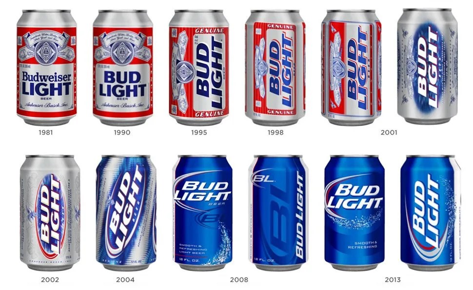
The hope is that their update to the Bud Light of old will help keep the beer relevant to a new generation of consumers whose preferences are swaying toward craft beer. “Both the packaging and the logo reflect our iconic commitment to a balance of modernity and heritage,” says Tosh Hall, the creative director at JKR who helped steer the design overhaul. The new look is characterized by an Anheuser-Busch crest, coupled with an uppercase typeface reminiscent of the letters found on the Bud Light cans spanning from 1990 to 1995. It does, however, persevere the blue color palette introduced in 2008, which has come to represent, visually, the antithesis of Budweiser’s flagship beer.
“Conceptually, we struck on this territory very quickly,” says Hall. “We put it into focus groups and refined it again and again based on the feedback we received. During a certain period, it seemed as if every wall in our studio was covered in something relating to Bud Light. I think at one point we might have even forgotten what color the paint was underneath.”
While the cans and bottles with the new logo have just begun to roll out across the nation, Hall is confident that the new look will resonate with the millions of Americans who drink Bud Light — or, perhaps more importantly, with those who do not. “The care and craft of this process is reflected in Bud Light’s new visual identity,” he says. “So far, [the response] has been overwhelmingly positive.”