The year 2020 marks the start of the new decade (unless you’re one of those well-actually-the-decade-starts-in-2021 pedants). The 2020s will be a crucial period for the car world, with fundamental elements the define our very relationship with the automobile in flux like never before. How will we pay for them? What fuel will they use? Will we even drive them?
Some of the world’s largest automakers have seen this transition period as a time to refresh and perhaps to reestablish their visual brand identity with new logos, following Apple iOS icons into a two dimensional, chrome-free future. There have been some hits — and one blatant miss. Below, we rank the recent new car logos from best to…whatever BMW just did.
1. Volkswagen
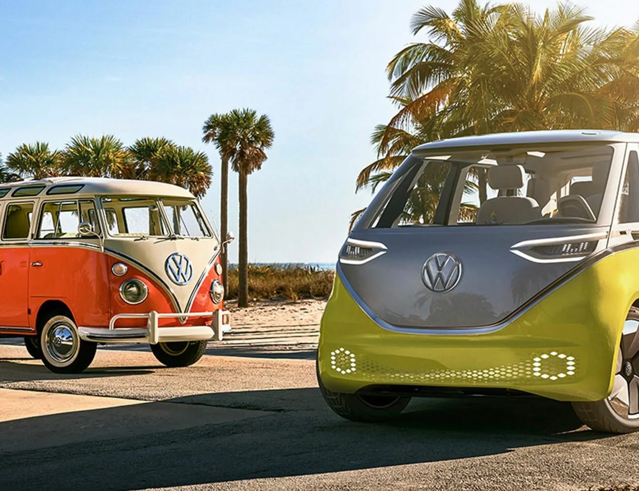
Volkswagen’s freshened logo is flatter then before; it uses a different font, and the W is detached. But changes were subtle, and it still reads very much like a VW logo. We’d give it an A+…but, alas, Volkswagen made more drastic changes to its “R” performance logo, which is unsightly enough to drag down our feelings about the brand as a whole.
2. Toyota

Toyota flattened and de-chromed the logo, and made the brand name more natural, to read with black text. It was a strong, subtle effort. So subtle, in fact, that I forgot the change even happened.